Pink Wallpaper Ipad & Simple Phone Wallpapers
When you want to give your daily tech a quick refresh, changing your device backgrounds is one of the easiest updates to make. A soft color palette can completely shift the mood of your screen without feeling overly cluttered or distracting.
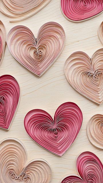
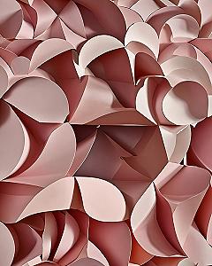
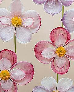
The main benefit of using textured paper art designs is that they add physical depth and warmth to flat digital screens. Instead of a standard solid color, you get subtle shadows and handcrafted details that look remarkably cozy every time you check your phone.
Choosing a specific shade changes the entire vibe of your setup. Leaning into soft pinks and subtle violet tones creates a calm, welcoming atmosphere that pairs nicely with standard app icons.
This handmade visual style suits a variety of personal preferences, whether you prefer minimalist layouts or busy digital workspaces. The gentle gradients and tactile surfaces work just as well on a larger tablet display as they do on a smaller handheld screen.
Let us take a look at a few ways to style your screens using layered paper art designs, starting with a clean overview of how these textures bring a device together.
#1 Choosing Soft Pink Heart Wallpapers for Your Tablet
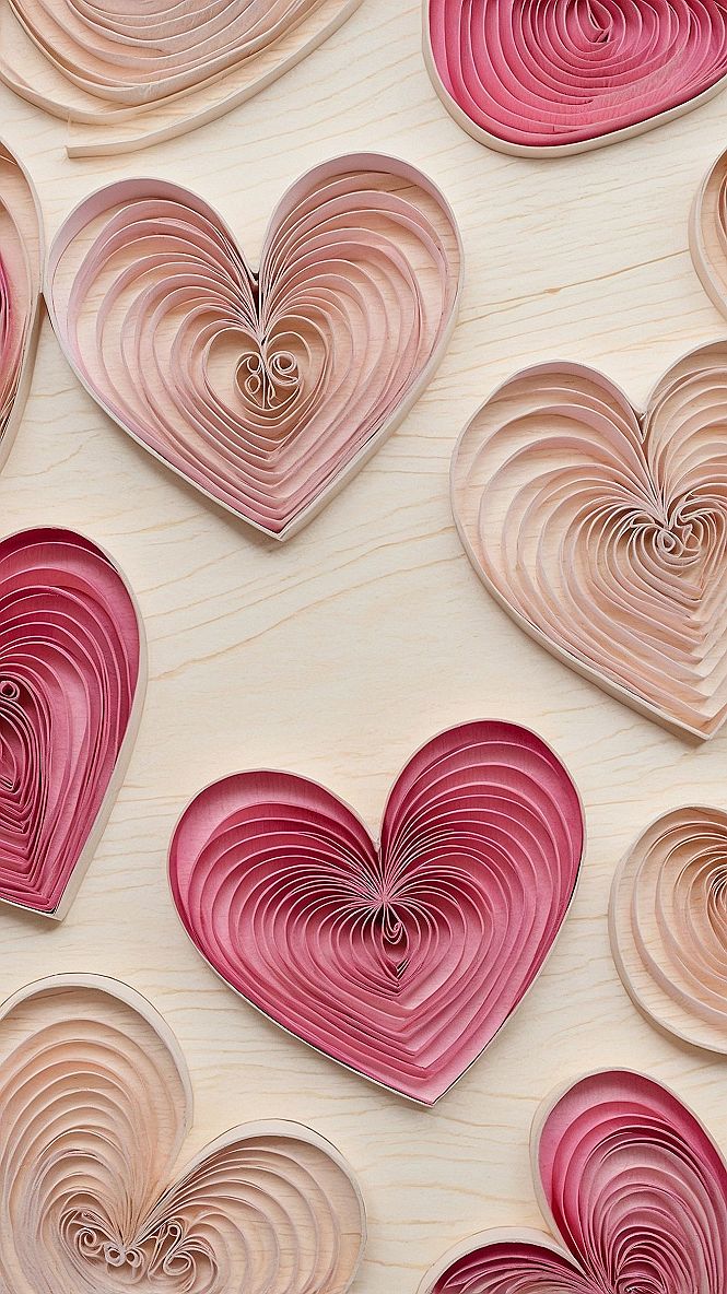
A pink heart wallpaper brings a warm and gentle touch to your iPad screen. This style uses simple shapes and soft shades to create a clean background that is easy on the eyes. It keeps your device looking neat while adding a little bit of personality to your daily routine.
When setting up your tablet background, try to pick a design with plenty of open space around the edges. This leaves room for your app icons so they stay easy to read. A balanced layout prevents your home screen from looking too busy or cluttered.
#2 Minimalist Pink Floral Patterns for Phone Wallpapers
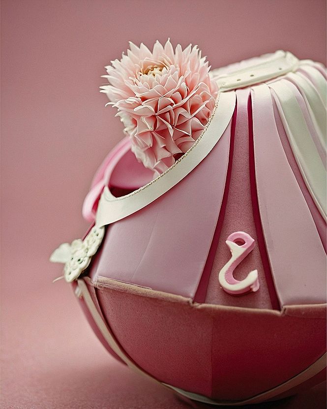
Simple pink floral designs work well on small screens because they keep backgrounds tidy and readable. When you set a clean bloom motif as your lock screen, notification text stays clear and easy to scan without visual clutter getting in the way.
This style suits anyone who likes a cheerful aesthetic without a busy layout. Choosing a soft flower pattern helps reduce eye strain during long work days while giving your tablet or phone a fresh, custom look that lifts your mood whenever you check the time.
#3 Selecting Pastel Anemone Designs for Digital Screens
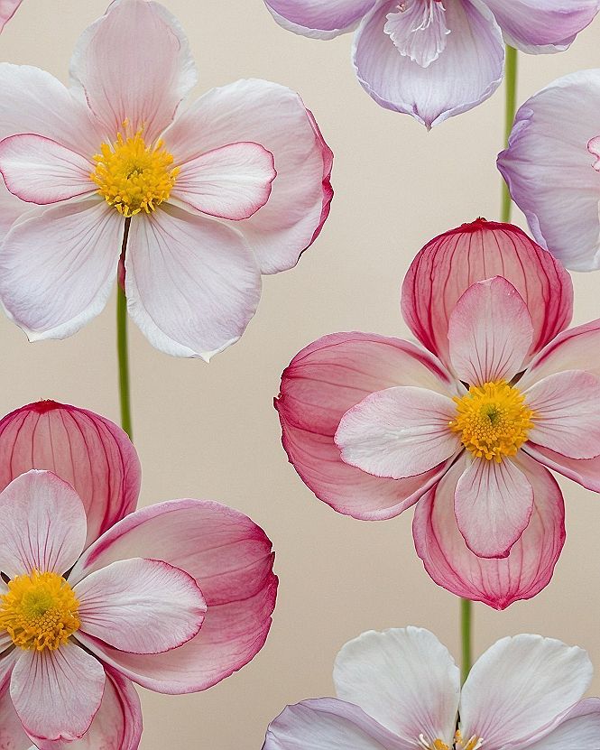
When picking a new background for your tablet or phone, consider how busy your app icons will look over the design. A soft pastel anemone print keeps things clean and readable. You want enough blank space so your calendar and messages stay easy to scan without straining your eyes.
If you want to customize your setup, try matching your device case to the subtle yellow centers of the flowers. You can also adjust your screen brightness so the pink tones do not clash with your favorite widgets. Simple tweaks help your entire device look pulled together.
Which style is calling your name?
#4 Maintaining Clean Lines With Layered Paper Wallpapers
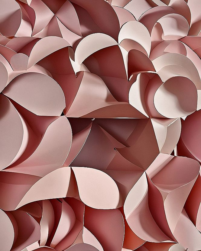
When you use textured paper art for your screen backgrounds, screen resolution makes a huge difference. High-definition downloads ensure the curved paper shadows stay sharp rather than pixelated. Saving the image in the correct format for your device prevents blurry edges and keeps the layered shapes looking crisp every time you unlock your phone or tablet.
To keep your home screen easy to read, try placing app icons over the smoother areas of the background pattern. Busy sections can make text hard to see. Giving your apps a clean layout helps the subtle shadows and tones stand out without causing eye strain during daily use.
#5 Adding Bright Poppy Accents to Pink Tablet Backgrounds
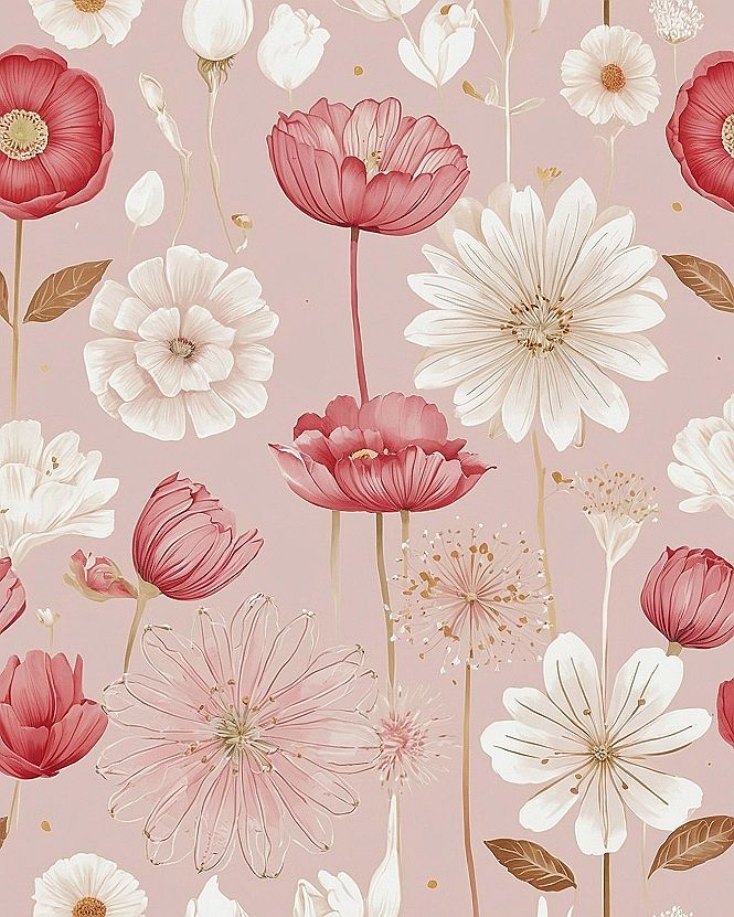
If you want a bit more contrast on your tablet home screen, I suggest trying a pink wallpaper featuring bright poppy illustrations. The deeper red tones stand out nicely against soft backgrounds so you can find your app icons easily without straining your eyes.
If red feels too bold for your daily setup, you can look for similar patterns in dusty rose or muted coral shades instead. These softer variations give you the same cheerful botanical feel while keeping your display calm and easy to look at all day long.
What's Your Style Personality?
Tap the look that speaks to you most:
Leave a Comment